A good explainer makes a specific idea understandable and shows enough evidence for the viewer to follow it. In a product video, that means accurate behavior, a clear sequence of actions, readable results, and narration that helps explain what is happening.
The review criteria in this guide help an editor identify a defect and compare a revised cut. They do not establish universal timing rules or predict audience results.
The example uses a fictional deployment tool whose workers build queued commits and record their results in a status table. The film explains how a failed build prevents a release.
The picture and voice explain the same idea
The worker changes to a failed state and the matching result appears in the table. Narration explains why that failure prevents release. The shared build identifier helps the viewer connect both surfaces.
A label can name the status, a short annotation can clarify a rule, and captions can carry the spoken words. Do not remove useful text simply because narration repeats it. Instead, check whether several elements are asking for attention at once or whether an explanatory paragraph is hiding the actual action.
Our authoring order is concept flow, visuals, narration, then audio. Writing to an established visual sequence helps keep prose specific. The recorded read still needs a synchronization pass.
Timing makes relationships readable
Show the action and its result in a sequence the viewer can follow. Timing works with layout, labels, connectors, and continuity; a small delay alone does not prove that one event caused another.
In the deployment example, keep the failed worker and its corresponding table row identifiable through the transition. If the relationship remains unclear, adding a shared label or simplifying the scene may help more than another timing adjustment.
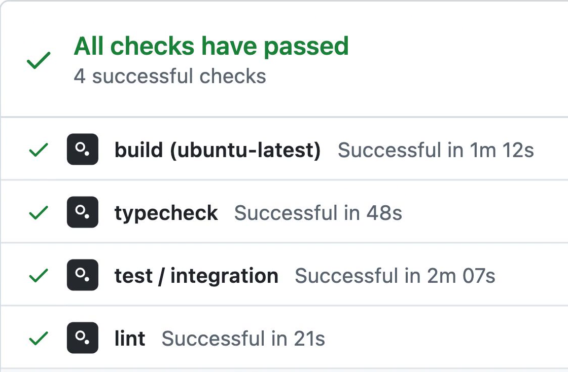
The important change is easy to find
A viewer should be able to find the focal action at the intended playback size. Several simultaneous highlights can obscure it. You might dim secondary surfaces, move closer, or stage the result where the viewer is already looking.
Preserve information the viewer still needs to read. An arbitrary opacity target can make labels inaccessible, and a dramatic camera move can carry the important result out of frame. Review the actual small-player composition rather than relying on the editing monitor.
Holds give the viewer useful time
A settled frame can allow a viewer to read a result, compare states, or absorb an explanation. Stillness is not evidence of failure. A hold becomes unhelpful when it is merely waiting for unrelated narration to finish.
Ask what the remaining words contribute. Keep time needed to inspect the failed build's details. Split a new topic into another scene, shorten repetition, or add a missing visual explanation. Continuous ambient motion is optional; it can distract from a useful comparison.
Motion follows the product behavior
A camera move can connect related surfaces or introduce a new subject. A cut can provide an immediate closer view. Choose the transition from the spatial relationship and information load, then check that the important moment remains readable.
Repeated actions also need an appropriate rhythm. Sequential steps may require separate beats; a batch operation may be clearer as a group. Do not randomize completion order merely to make a system seem real. Preserve the relevant behavior and clearly identify any illustrative simplification.
The result provides evidence
A result should answer the question established at the beginning. In the deployment example, the failed build and blocked release need to be visible and correctly related. A second full run is useful if it demonstrates a different condition; repeating the same outcome may add little.
A persistent record can help when accumulation is the lesson. Other scenes may need a clean transition to reduce clutter.
Check all depicted states against the product. Clearly labeled fictional demo data is compatible with accurate behavior. Inventing an unsupported feature and presenting it as a working product is not.
Review the complete cut
Use these questions to write specific, timestamped feedback:
- What question does this scene answer, and is the answer visible?
- Can the viewer connect the action with its result?
- Are important labels and changes readable at delivery size?
- Does each hold provide reading or thinking time?
- Do narration and captions match the approved action and audio?
- Does another example add a meaningful distinction?
- Are the product behavior and any illustrative simplifications clear?
Stills help check composition; muted playback helps check visual continuity; listening helps check prose and delivery. Watch the complete video with sound before approving it. The review scorecard collects these checks in a reusable format.
A launch explanation and a detailed tutorial may need different runtimes. Visual timing and the actual read determine how much time the chosen task requires.